Is This What We Envisioned for Van Aken?

From Cleveland.com

We’ve come a long way.
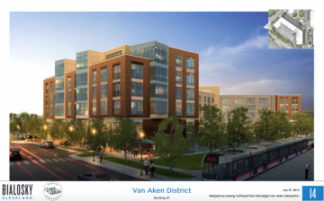
If you haven’t see the latest drawings presented on Cleveland.com for Van Aken shopping center, check the link below. It certainly is a big change. In fact, it doesn’t really look like Shaker Heights. My parents have lived a few blocks from Van Aken for 40 years and over the years there have been ideas to revitalize the area that have come…and gone. Remember the old Manner’s Restaurant? I still remember years back when there was a fight about whether or not to put in a McDonalds where Wendy’s is currently located. As a kid, I was all for it. Now, as a parent myself, I totally understand why my parents worried about creating more traffic and congestion so close to our neighborhood and schools. The parents in our town fought hard against it and won.
 I’m excited that the Van Aken area revitalized. It needs it. I folks in Shaker–especially in the old Sussex are–have always felt so fortunate to live in such a pretty town where dinner, shopping and the rapid were just a sort walk away. The new designs for Van Aken are sleek and contemporary; in fact, they’re almost corporate-looking. It would be wonderful if some of Shaker Heights’ historic character was incorporated into the aesthetic.
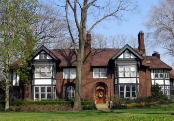
If you’ve lived in other places, you know, there’s no place quite like Shaker Heights. It is filled with beautiful, architecturally-unique and distinguished homes. The founders of Shaker, Van Sweringen brothers, had such a well-thought out vision of how Shaker would look like and how it would function as a community. Strict guidelines were imposed on details like building heights, color palettes architectural styles to ensure the integrity of our town. And while at times, I’m sure it frustrated some people, it has allowed Shaker to remain consistently beautiful and to maintain a place on the National Register of Historic Places. Across the country, Shaker Heights has a reputation for its standard.
I would be curious to know the inspiration behind these designs and if as much thought was put into them as our founders put into our “village.” The founders of Shaker Heights had a meticulously planned out vision for our town. Do the new designs reflect this standard? I wish that the new designs gave a “nod” to the historic character of our town or incorporated elements that make our beloved town unique. I am not against combining modern with traditional. I love how The Cleveland Museum of Art has blended old with new. And unlike some, who think that Frank Gehry’s building in University Circle is an eye sore, I am crazy about that building and seeing its shiny parts peak up above University Circle. I just question if this what we all envisioned for Van Aken. I am hopeful that when designs are finalized that the area around Van Aken will reflect the same high standards of design that has been an integral part of Shaker Heights’ history and for which we are so proud.
To check out all the drawings, visit cleveland.com
 Looking for Something Fun to Do in Town?
Check Out Mix and Mingle.
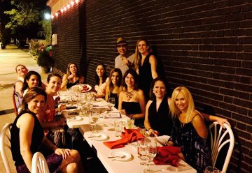
 Our Favorite Spot for a Girls Night:
Dinner Under the Stars in Little Italy.


